

In honor of the 20th anniversary of Compassionate Action for Animals, we have a new visual brand identity. Super exciting!
The redesign process began last fall, led by designer Danami Maurice Champion. A team of CAA staff, board members, and volunteers gave feedback on design direction, and now we can share the end result: CAA’s new logo, colors, typography, and more. (Twin Cities Veg Fest and Bridges of Respect will each get new looks later this year. Stay tuned for that!)
Over the next six months you’ll see a gradual changeover in CAA’s visual materials, everything from our printed brochure to our social media to our website. Today, you get to feast your eyes on the overall plan, a bold new look that aims to reach a bigger spectrum of the Twin Cities community. You’ll also read about the ideas behind the design choices, starting with the attributes of our brand.
Brand Attributes
A guiding force in the design was found in recognizing the brand attributes for CAA: welcoming, supportive, empowering. All of the decisions made about the design referred back to these attributes, what we believe CAA primarily does for our target audiences. One way to say it is that we welcome people into our community, provide support for their transition to compassionate living, and empower them to take effective action for farmed animals.
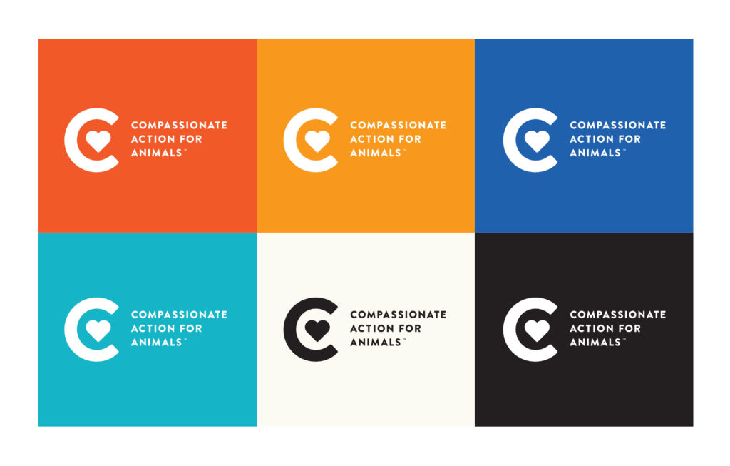
Logo Lockup
The logo lockup is a combination of an icon and the title of our organization.
![]()
The simple design allows for easy recognition and memorability, which is key. The geometric shape of the C is an open circle suggesting an open community that’s passionate about animals, and the heart supports that idea.
Typography, Layout, Brand Assets
Other aspects of the new style include specific typography, recommendations for layout, and special patterns.
Below are three patterns that can be incorporated into CAA’s visual materials in a variety of ways. As you can see, they each represent a familiar farmed animal. They will provide the presence of animals when images aren’t suited, such as with stationary materials.

Colors
The colors are intended to convey a warm and energizing personality, again referring back to the brand attributes. The warm colors communicate energy, encouragement, and action. They are associated with heightened emotions and passion. The cooler colors provide contrast to the warmer tones and also communicate trust, peace, and unity.
Another key feature of this color palette is that it’s unique to CAA within the sphere of farmed animal advocacy; no other organizations with missions similar to ours share these colors.
Note that the deep red-orange at the top left is our key brand color.
In Summary
Our mission remains centered on helping farmed animals, and we believe the new visual brand identity will help us to be more effective, increasing our capacity to reach more people with a message of compassion for farmed animals. With increasing numbers of people making compassionate choices, we can help more animals, and that’s what it’s all about.
Below are some other fun (and inspiring!) images that Danami, our designer, cooked up to give us a sense of our how new visual brand could be put to use. Just imagine the possibilities!


